
THE GIST
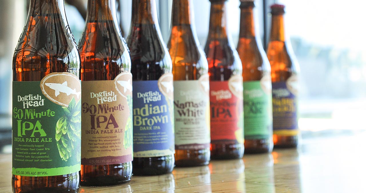
Dogfish Head has unveiled new packaging designs for its core portfolio featuring artwork heavily focused on the individual ingredients that go into making each beer. The initial designs are slated to hit shelves in October, with more new designs to make their debut later this year, per a statement from the company.
WHY IT MATTERS
In and of itself, a brewery slapping some new artwork on their bottles isn’t too big a deal. Dogfish has been kicking around for 21 years now, and a simple redesign won’t confuse aisle shoppers with even a passing familiarity with craft beer. What is interesting here, though, is merely the direction Dogfish is taking by putting the spotlight squarely on the ingredients that go into making their products. (Think: Namaste White with a fat orange slice featured prominently on the label). If anything, this move seems overdue, given the ethos that founder Sam Calagione says the company was founded on. Take it away, Sam:
“My goal was to make truly unique beers based on the idea that culinary ingredients from around the world could be as integral to brewing distinct beers as the finest barley and hops.”
Believe it or not, this ties to a larger issue.
If you’re reading this website, I would hedge that you remember the now infamous Budweiser “Brewed the Hard Way” Super Bowl spot of two years ago. In it, the beer giant jabbed craft beer itself—and those who drink it—with a bit of “hipster” nonsense. Most comically, due to a recent acquisition the company had made of a brewery that makes such a beer, the spot declared, “Let them sip their Pumpkin Peach Ale. We’ll be brewing us some golden suds.” It was, quite literally, an attempt at shaming “weird ingredients,” as though they represented a defining characteristic of craft beer.
Taking the dig in stride, Dogfish quickly tweeted evocatively, “Hmmmm…. Pumpkin Peach Ale…” Calagione and company certainly haven't backed away from that message, and either have others. Instead, it's become the "taco truck on every corner" of beer labelling—embrace it fully, and ramp it up. If you need additional proof of this, go compare the latest Blue Moon packaging to, say, that of Coors Light’s. One is the silver bullet. The other is lovingly adorned by honeycombs and hops.
Highlighting premium or unique ingredients can go a long way in tilting consumer perspective in your direction. Because everyone, from Calagione to Carlos Brito, knows you look at the label on the bottle.
—Dave Eisenberg
READ MORE
Dogfish Head Announces New Packaging Design [Beerpulse]